
Redefining Legacy.
The brand book for The Haus of H. A house being built for queer people across every stage of life. What we are, how we look, how we sound, and how we hold the line.
EST · MMXXVI
The brand book for The Haus of H. A house being built for queer people across every stage of life. What we are, how we look, how we sound, and how we hold the line.
Not a vibe. Not a movement. A house. With a name above the door, a standard inside, and a long horizon. A house being built for queer people across every stage of life, with elders at the center.
The retreats fund the house. Project Pandora is the house in physical form: elder care, communal living, and a retreat center on land returned to its first stewards. The Witches Ball is the annual gathering. Heartagena extends the house abroad in partnership. The Queer Vanguard Festival invests in the next generation of cultural authorship.
The brand carries itself the way a fashion house carries itself. Clear. Calm. Well tailored. Expensive without trying. Warm at the close. The work is serious. The presentation is restrained. The luxury is in the discipline.
Intergenerational. Land-backed and Indigenous-partnered. Funded by retreats, governed by mission. Quietly magical, never costume-mystical. Aspirational in execution, real in substance.
Queer elders who never had a place built for them. Queer adults looking for real community. People who came for an escape and found a foundation. Allies who fund what they say they believe in. Donors who back what is real.
A wellness brand. A festival aesthetic. A spiritual practice. A protest poster. A startup pitch. The brand carries weight because it does the work, not because it performs the work.
These shape every decision the brand makes. They are not marketing copy. They are the floor.
Family is built. Chosen, intentional, intergenerational. The brand never assumes blood-family is the default. Every voice in the room reflects that.
Queer authorship of queer futures. The brand draws from fashion-house posture, mystical practice, and intergenerational care, but is owned by no one outside the community we serve.
The space is being built so the next generation does not have to ask for it. The brand operates on a hundred-year horizon, not a quarterly one.
Wherever the brand expands, it expands in partnership. With Indigenous communities. With local cultures. With queer creators. Nothing is taken. Everything is co-built.
The Haus of H operates in two modes. Every surface, asset, and campaign uses one or the other. Mixing them dilutes both. Pick the mode first. Build from there.
Use for. About page, donor decks, Project Pandora page, foundation correspondence, press, board materials, capital campaign, long-form editorial.
Reads like. A cultural institution presenting itself with weight.
Voice. Spare. Patient. Unhurried. Names the hundred-year horizon, the land, the partnerships.
Visual. Velvet Midnight backgrounds. Generous whitespace. Cormorant for display. Centered or left-aligned editorial layout. Faded rainbow as a hairline. Black-and-white archival photography permitted.
KPI. Trust. Authority. Funding.
Use for. Retreat pages, ticket pages, paid ads, social campaigns, email sequences, landing pages, founder updates, founder reels.
Reads like. A house inviting you in.
Voice. Warm, plain, specific. Names what is included. Names the dates. Names the price. Closes with one clear action.
Visual. Daylight backgrounds more often. One hero photograph, well lit. One body of text, one CTA. Pricing visible. Inclusions visible. Faded rainbow used sparingly as a divider.
KPI. Reservations. Bookings. Email signups. Application fills.
Pick one mode per surface. Never both.
The canonical hero copy. Three tiers. Use them in this order, at this scale, in this voice. Anywhere the brand needs to introduce itself fully, this is the lockup.
Redefining Legacy.
The Haus of H is a house for queer people across every stage of life.
REDEFINING FAMILY ·
RECLAIMING SOVEREIGNTY ·
EMPOWERING QUEER FUTURES.
Redefining Legacy → Legacy Redefined.
The slogan is built to grow with the Haus. Today it reads forward: Redefining Legacy. The day The Haus of H opens its first eldercare and intergenerational facility, the tense shifts: Legacy Redefined. Same words. New ground. The promise made real.
Every full brand introduction lockup uses all three tiers. Marketing surfaces (ads, social) typically lead with the slogan only. Stewardship surfaces (donor decks, About page) carry all three.
The Wordmark carries the brand's editorial voice. The Sigil carries the mark at icon scale. Together they are the system.
WordmarkWeb header · signage · billboards · retreat covers
 Inline LockupSite nav · email signature · business cards · social bio
 FaviconBrowser · OS dock · app shortcut
The mark holds at any size and in either mode. Don't break the system below.
Never rotate, skew, or warp the wordmark or sigil. The geometry is the brand.
The mark renders in cream on Velvet Midnight or ink on Daylight. No other color combinations. Never pure black on Velvet Midnight.
↑ BELOW 32 PX MINIMUM
Wordmark minimum height: 32 px digital, 12 mm print. Sigil minimum: 16 px. Below those sizes, switch to the inline lockup or omit.
Never place the mark directly on a busy photograph without an underlying ink or bone wash. The mark needs negative space equal to the height of the H.
Never re-encircle the wordmark with the mission statement or any decorative ring. The slogan, descriptor, and mission live as separate copy.
Don't outline the wordmark, fill the sigil with patterns, or apply drop shadows. The mark is single-ink only.
Never stretch, condense, or change the proportions of the mark. Aspect ratio is locked. Scale uniformly, always.
No drop shadows, glows, gradients, embossing, or 3D effects on the wordmark or sigil. The mark is flat single-ink only.
Velvet Midnight is the brand's primary field. Daylight is the alternate field for moments that need to feel lived-in. The faded rainbow is the device that links them. Purple is an accent and motif. Never a master.
Cream or bone is the only acceptable text color on Velvet Midnight surfaces. Black or near-black ink type belongs on Daylight only. Gilded Brass and Champagne are accent colors. Never used as primary text on any surface. The faded rainbow gradient never carries text directly; it lives as a divider or wash.
The Editorial Heritage system carries the brand's everyday voice. The Cinzel system is held for ceremonial, ad, and invitation surfaces. Used together with discipline, they make the brand feel both literary and theatrical.
Redefining Legacy.
A long-term, land-backed, Indigenous-partnered project to build the first real infrastructure for queer lives. Elder care. Communal living. A retreat center. Cultural programming. Funded by what we make together.
Used on · the website, About, Project Pandora, Heartagena, donor decks, retreat program guides, the brand book itself, email body, blog. Disciplines · Cormorant italic for hero / display moments only; Cormorant regular roman for sub-display; Inter for body, navigation, captions; DM Mono for labels, metadata, fine print. Don't · use Cormorant at body size; use Inter at display size.
THE WITCHES BALL
Fruits of Freedom
Cinzel does the institutional work. Cinzel Decorative is held in deeper reserve for the rare ceremonial flourish. Inter still carries the body so the system stays legible.
Used on · ad headlines, invitations, retreat covers, event posters, ceremonial pages of the website, social campaign launch graphics, the deity-dance-party night and the Witches Ball. Disciplines · Cinzel only at display size; Cinzel Decorative only on the load-bearing word; never both at the same scale on the same surface. Don't · use Cinzel for body, navigation, or anything users have to read fast.
Each role has a defined size and weight. Don't invent in-between sizes. Pick the closest role and use it.
Redefining Legacy.
Cormorant italic 300 · 88–132pxLegacy Redefined.
Cormorant italic 400 · 48–76pxThe non-negotiables.
Cormorant 400 · 32–46pxProject Pandora is the space itself.
Cormorant 400 · 24–32pxThe retreats are how we fund the space. The blueprint is ours. The doors stay open.
Inter 300 · 16–18pxEST · MMXXVI
DM Mono · 10–12px · 0.22em trackingTHE WITCHES BALL
Cinzel 500 · 24–58pxFruits of Freedom
Cinzel Decorative 700 · used once per surfaceDeclarative. Warm. Direct. Never apologetic. The voice sounds like the people building the house, not like a brand introducing itself. The voice stays elevated. The load shifts by mode. Mode A for cultural weight. Mode B for warm invitation.
Statements, not pitches. "The Haus of H is a house for queer people across every stage of life." Not "We hope to be..." or "We aim to build..."
Warmth is in the verbs we use ("we build," "we hold," "we open"). Not in adjectives. Never "magical journey." Never "transformative experience."
Short sentences. Specific nouns. The reader never has to ask what we mean.
The magic is in the room, not the adjectives. The brand never explains its own atmosphere. A well-placed image, motif, or word does the work.
The brand has authority because it has done the work. It does not perform expertise.
The brand carries itself the way a fashion house does. Calm. Considered. It does not chase. It does not overexplain. It says what it is and lets that stand. Warm at the close.
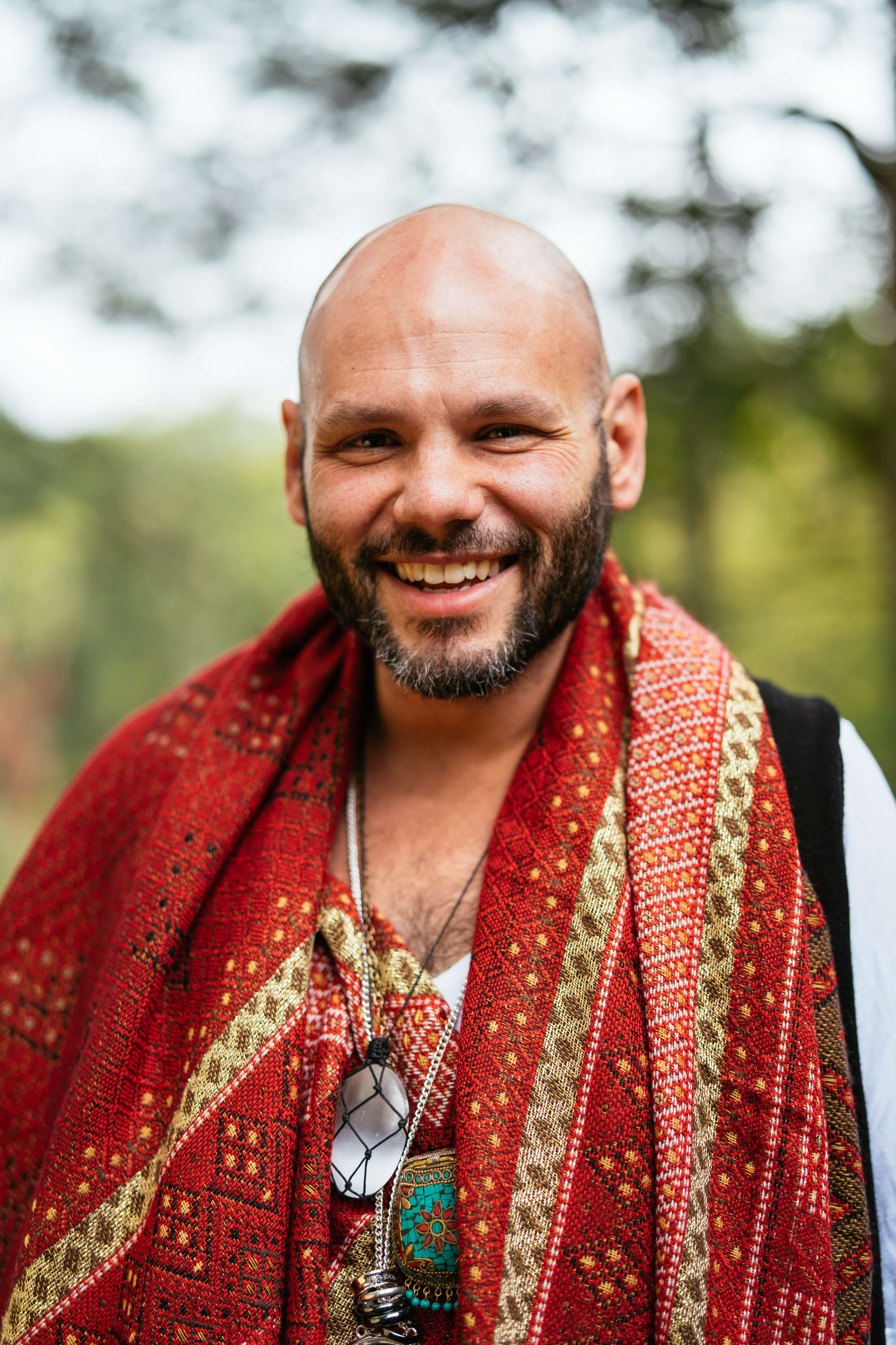
Photography balances community truth and aspirational composition. Warm light. Real bodies. Generations in the same frame. Editorial framing. One image carries the page. Galleries are the exception, not the default. No stock. No clinical staging. No rainbow draping.
Portrait, architecture, land. Quiet rooms. Single-subject portraits with clean backgrounds. Black-and-white archival permitted. The same care given to a room as to a face.
Hero shots of the actual experience. People mid-meal, mid-conversation, mid-laugh. Spaces guests will sleep in. Food they will eat. Light they will see. One image per page.
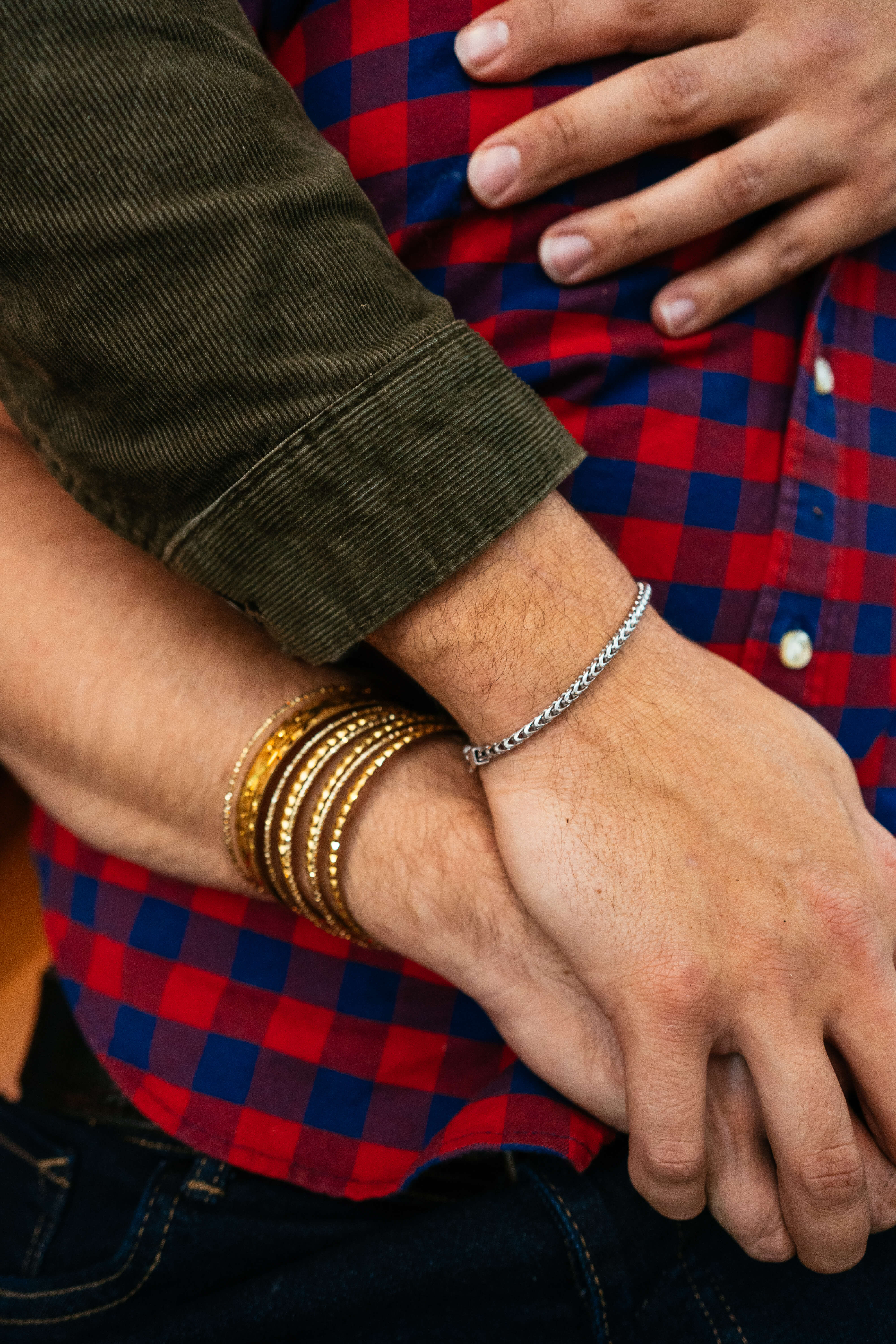
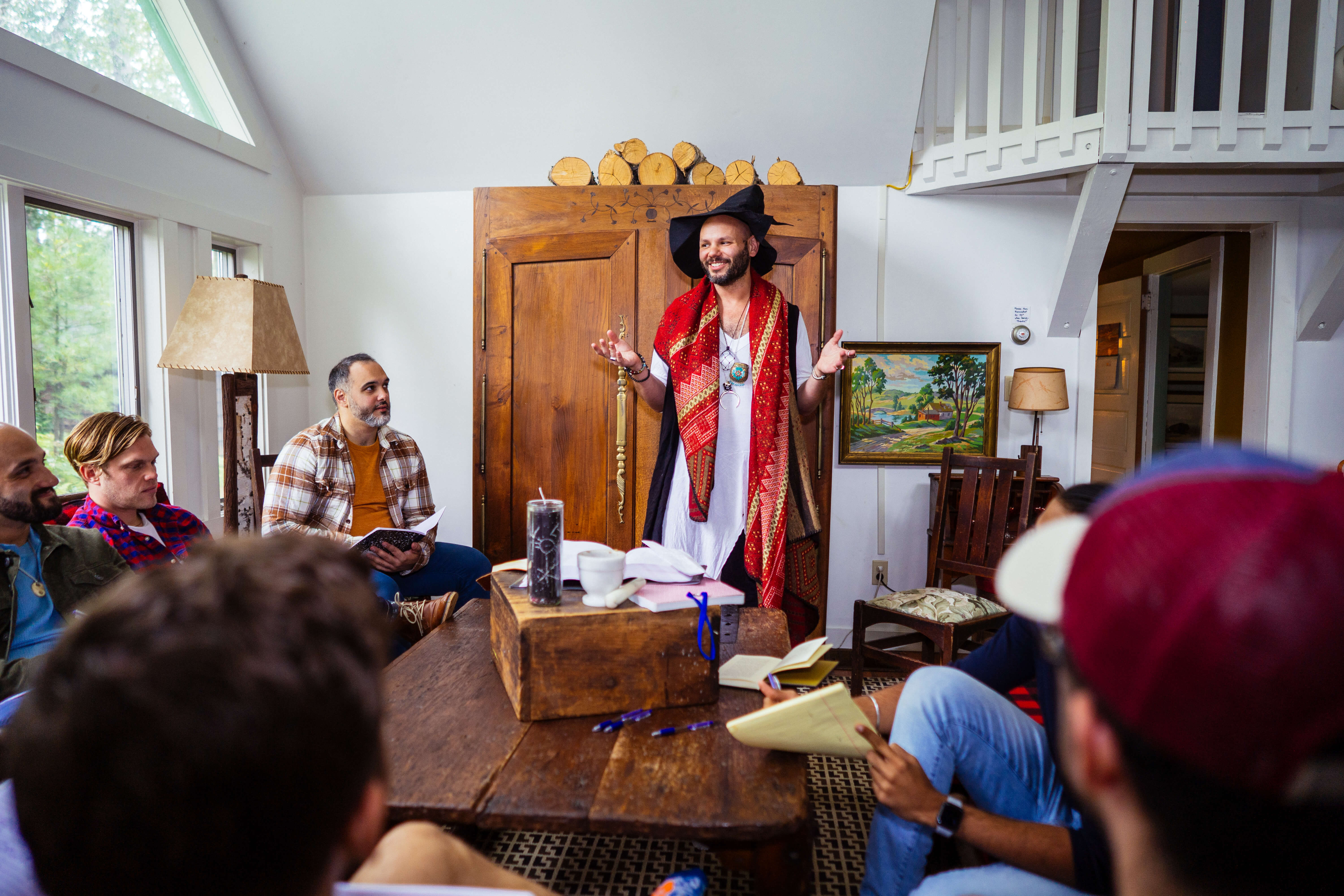
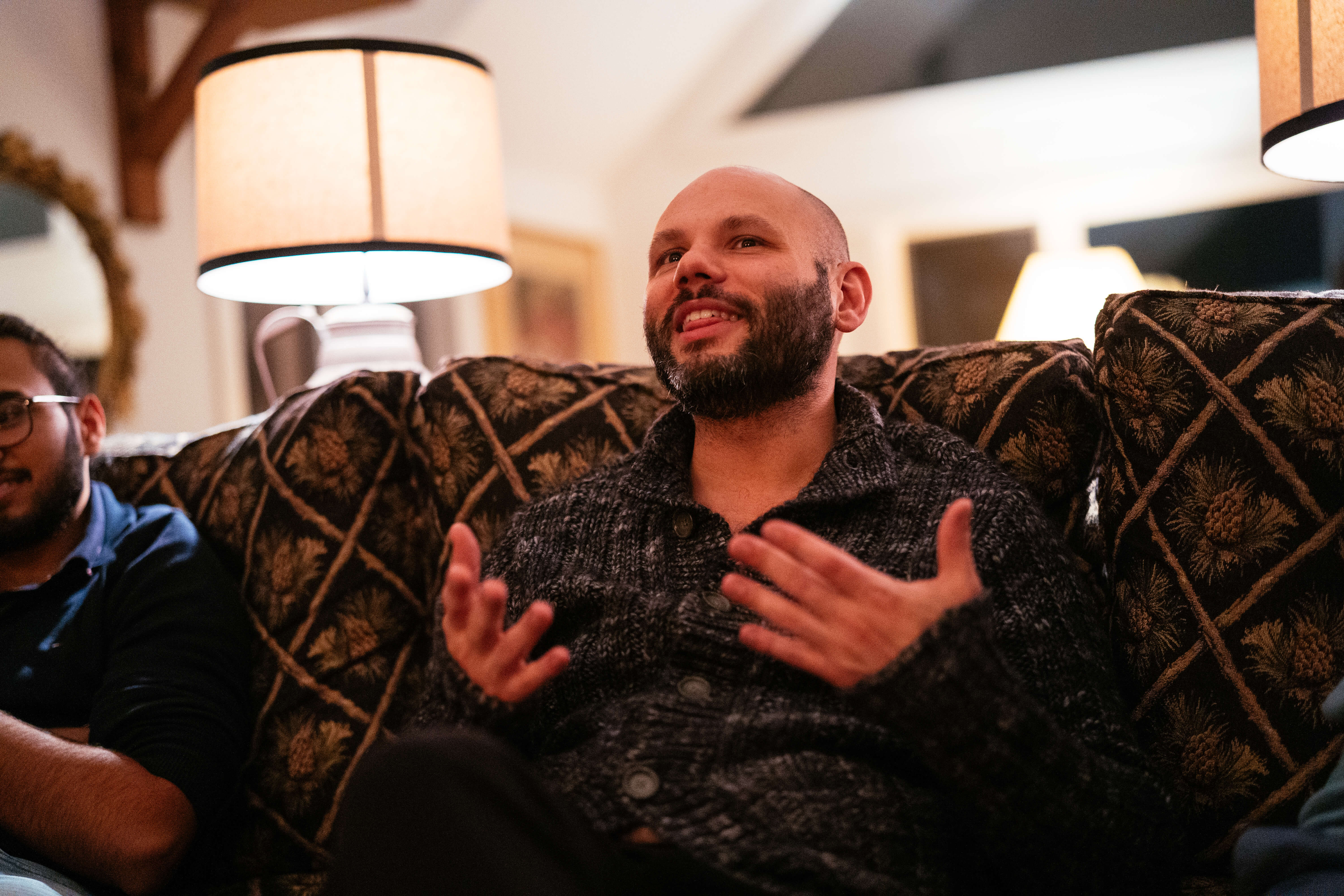

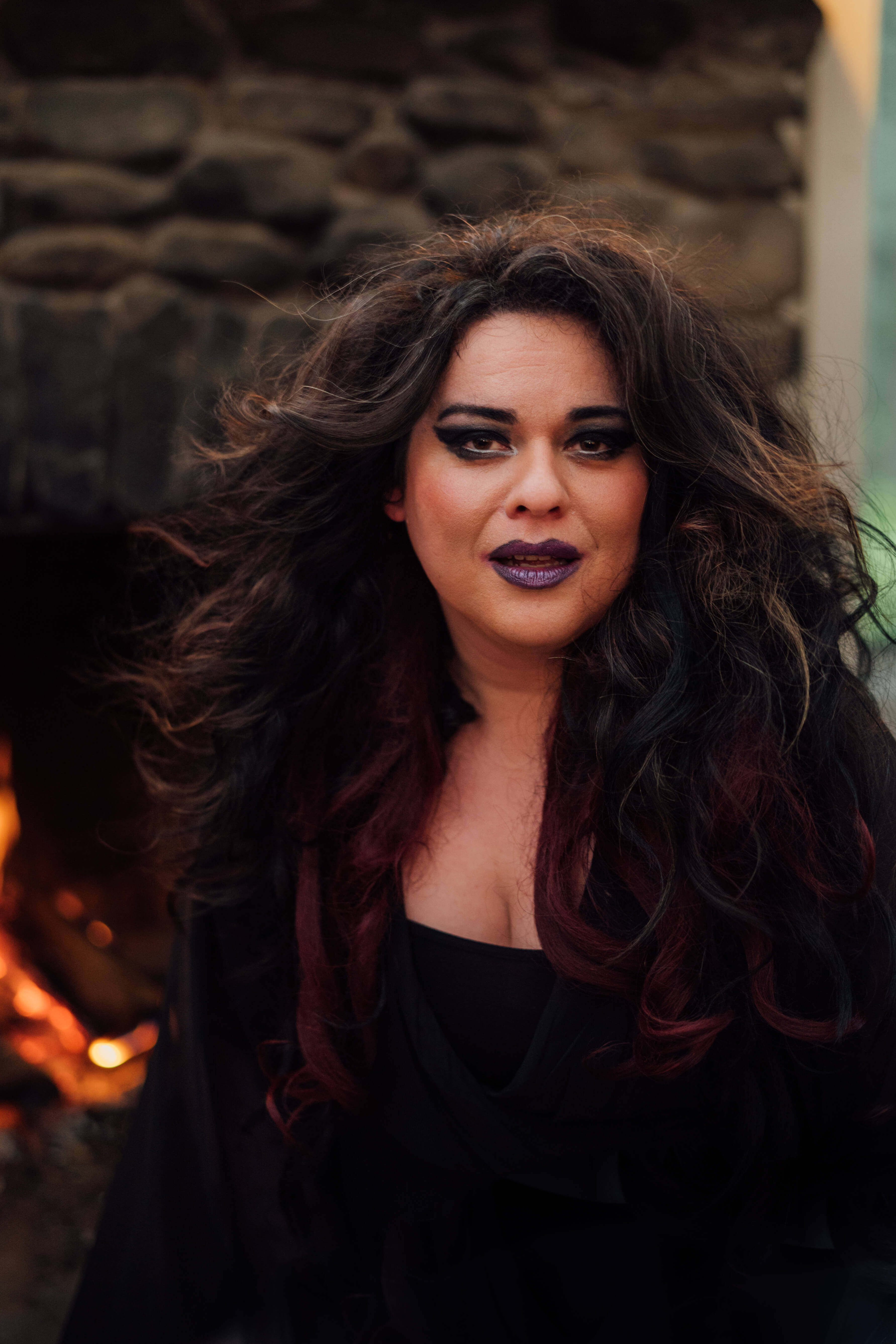
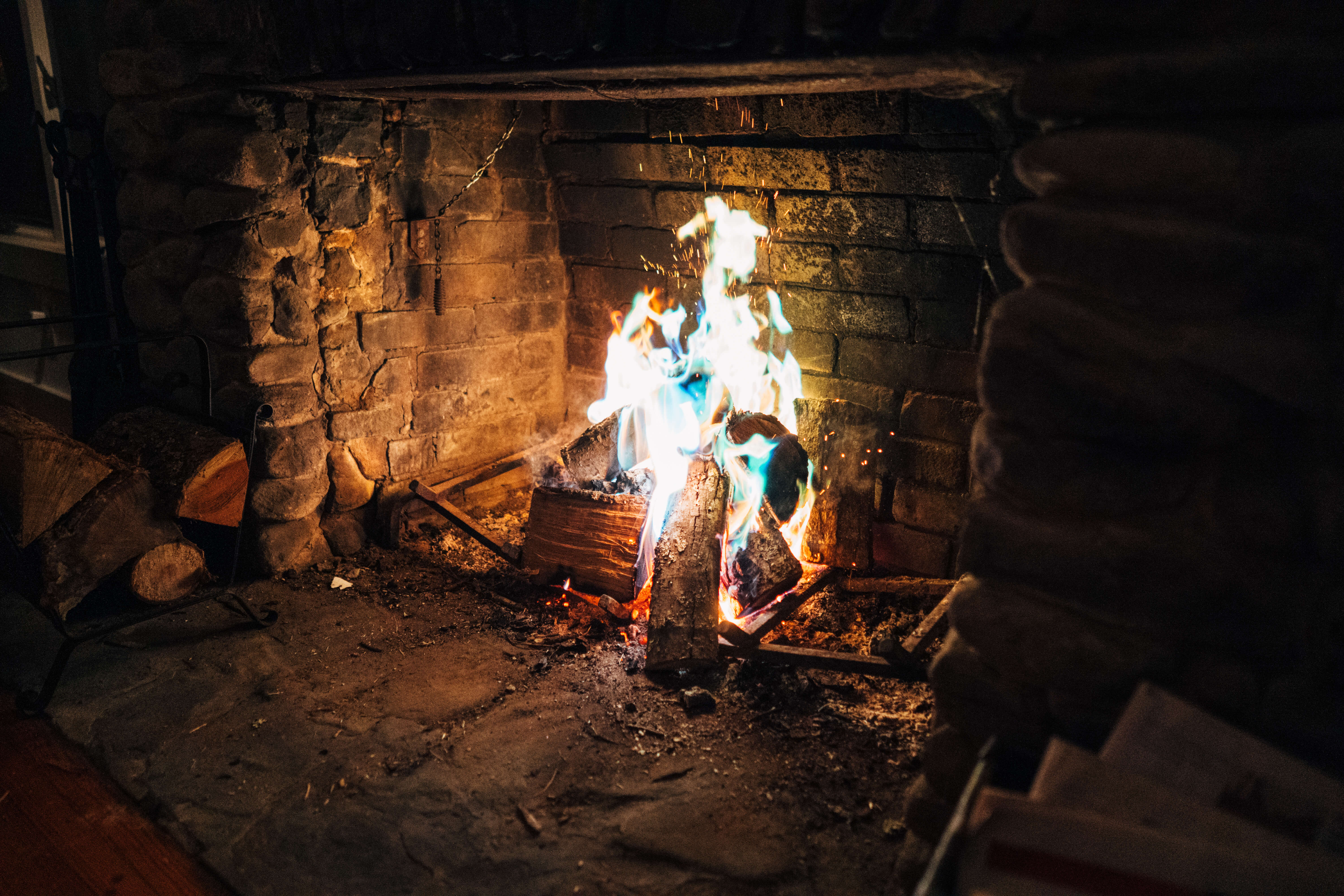
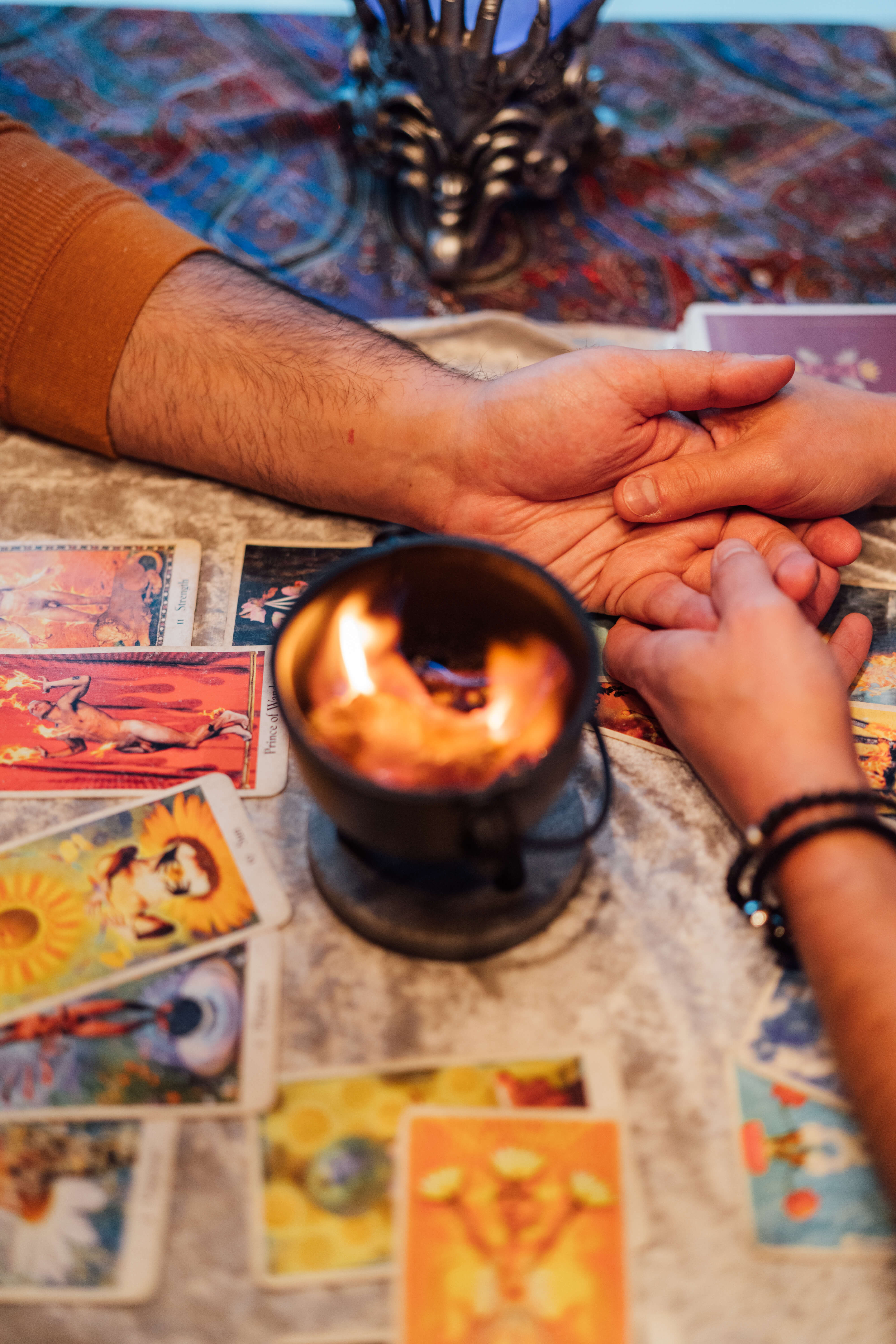
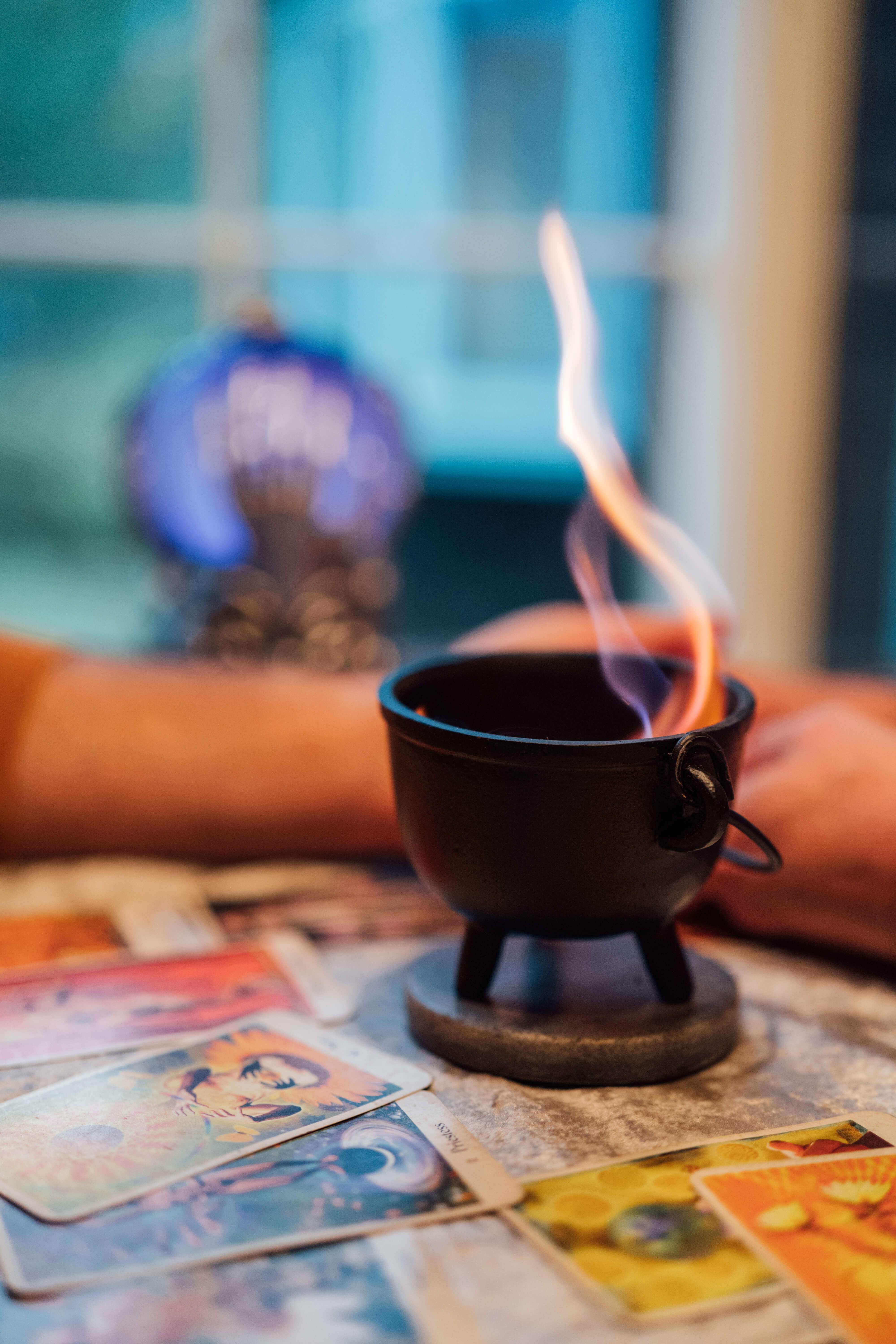
Hold for warmth. Use natural or candle-warm light. Show real bodies, real ages, real intergenerational rooms. Frame queerness as the default, not the subject. Let the moment carry the image. Eye contact. Hands held. Candles lit. Doors open.
Stage it. Drape it in rainbows. Substitute symbols for people. Use stock. Use harsh flash. Make queerness the spectacle. Apologize for itself. Sex-up retreat images. Crop out elders.
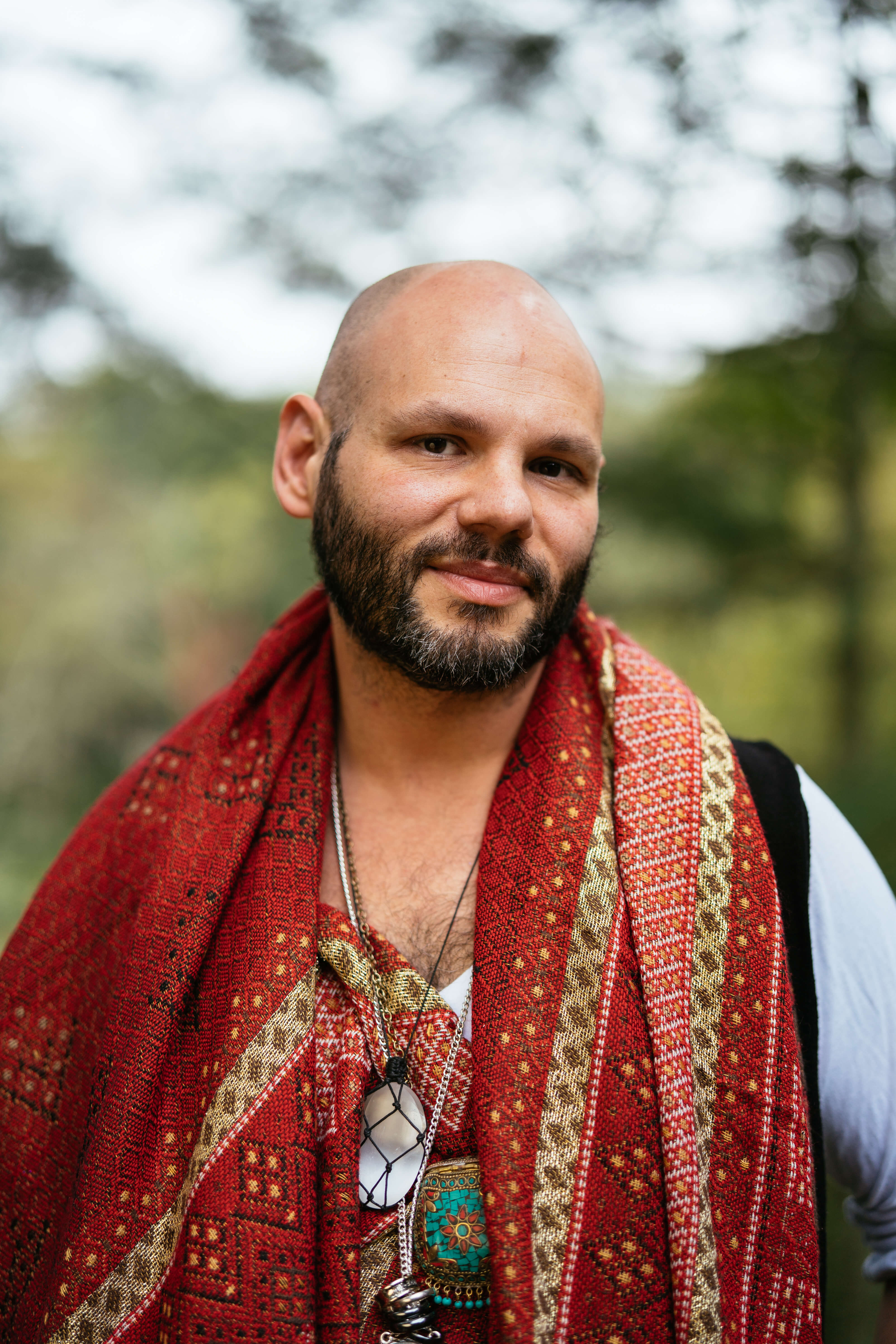
The founder
"There is no real plan for queer people as we age. So we are building the one there should have been."
Juno L. Epifanio, MSW · Founder · The Haus of H
Beyond the logo, the brand has four small recurring shapes. Used together with restraint, they make the brand recognizable without ever needing to repeat the wordmark.
A 2px horizontal gradient bar. Rose → mustard → sage → slate → plum. Used as section divider and brand signature. Never a full background. Never high-saturation.
A single small filled dot. Sits above the wordmark. Functions as a fixed star. Orientation, beginning, beacon. Used at the opening of editorial moments.
A small almond-shaped eye with a center dot. Lives inside the H crossbar in the wordmark. Appears nowhere else at full scale. Used as a watermark inside type, never as a standalone shape.
A thin horizontal hairline rule. Used beneath the wordmark, between display and metadata, and as a quiet section break. The threshold the reader steps across.
The brand alternates Velvet Midnight and Daylight section by section. Sections are vertical. Whitespace is generous. Grids are simple. Editorial restraint is the default, not the exception.
Six steps. Use only these values. Don't invent in-between sizes.
Sections alternate Velvet Midnight ↔ Daylight. The faded rainbow bar marks every transition. Each section opens with a numbered eyebrow ("01 · The Posture") and a Cormorant section title with one italicized phrase. Section padding: 120px top and bottom. Inner max-width: 1180px.
Surfaces drawn from the dual-mode system. Mode A for cultural weight and donor trust. Mode B for retreat sales and conversion. Each surface carries the same brand without being told what brand it is.
Funded by retreats. Built for elders. Open to everyone we are building with.

Five days. Twenty guests. One house. Workshops, meals, and rest. All included. Hosted by Juno L. Epifanio and the team that built the room.
The annual gathering where partners, elders, and the next generation meet in one room. The night that funds the year ahead.
Two acceptable treatments. Inline lockup carries the most identity in tight horizontal space. Wordmark-only is the editorial alternate when the card front holds the mark and the sigil lives on the reverse.
Juno L. Epifanio
Founder · MSW
juno@thehausofh.org
Juno L. Epifanio
Founder · MSW
juno@thehausofh.org
Family is something we build.
Which lockup goes where, at a glance.
Before any piece of brand communication ships, run it against the nine rules below.
Pick one mode per surface.
Mode A for institutional and donor surfaces. Mode B for retreat and conversion surfaces. The mode decision precedes the design decision.
Mix Mode A and Mode B in a single surface.
A donor deck written like a retreat ad reads cheap. A retreat ad written like a donor deck reads cold. Pick the mode. Stay in it.
State what the brand IS.
"The Haus of H is a house for queer people across every stage of life."
Lead with what the brand isn't.
Never open public copy with "not a wellness brand" or "not a retreat company." Frame positively. Internal contrast is fine; external negation is not.
Alternate Velvet Midnight and Daylight.
Pure dark wears thin; pure light loses the mysticism. Both, in rhythm.
Wall-to-wall the same mode.
A whole site or deck in only Velvet Midnight reads as a nightclub. Only Daylight reads as a wellness brand. Always alternate.
Use cream / bone type on Velvet Midnight.
Check every dark-field surface. The legibility rule is non-negotiable.
Use black or near-black type on Velvet Midnight.
Ever. Under any circumstance. If a card is purple, the type on it is cream.
Hold purple as accent.
Aubergine and plum punctuate the brand. They are not the field.
Lean on purple as the dominant color.
The brand should not read as "purple brand" at any scale. Purple marks mysticism, not identity.
Use Cinzel Decorative on a single load-bearing word.
Once per surface. The decorative cut earns its place by being scarce.
Use Cinzel Decorative for body, navigation, or twice on the same surface.
The font is ceremonial. Used too often, it reads as cosplay.
Photograph the people who walk in.
Real bodies. Real ages. Generations in the same frame. Warm light. The room as it is.
Use stock, drape rainbows, or stage diversity.
If a photo could appear on any other brand's site, it doesn't belong here.
Write declarative sentences.
Short. Specific. Direct. The voice never apologizes for itself.
Use wellness or empowerment vocabulary.
No "transformative." No "authentic journey." No "curated experience." Specificity over filler.
Re-encircle the wordmark with breathing room.
Negative space is the frame. Equal to the height of the H, minimum.
Re-encircle the wordmark with the slogan or any other ring.
The old wordmark had a slogan ring. We retired it. The slogan and mission live as separate copy now.
Six surfaces. Six voices of the same space. Read these aloud. They should sound like the people building the space.
Redefining Legacy.
The Haus of H is a house for queer people across every stage of life.
We are building the space our elders never got to walk into. We are building it for them, and for the next ones, and for everyone in between.
Pairs with: full mission statement underneath. "Redefining family. Reclaiming sovereignty. Empowering queer futures."
Project Pandora is the space itself. Elder care. Communal living. A retreat center. All on land returned to its first stewards.
The blueprint is ours. The doors stay open.
A WEEK ON A PRIVATE ISLAND OFF CARTAGENA
Held by queer facilitators. Designed to dissolve the patterns we inherited and surface the lives we are choosing.
Doors open August 21.
There are rooms where the future is built. This is one of them.
Pairs with: a single sentence beneath naming the cause. "Tonight funds the house we are building for the family we are choosing."
Redefining Legacy.
Doors open August 21. Cartagena. Queer-only. Held by us.
Link in bio.
Pairs with: a feed image set on Daylight mode for stewardship posts, Velvet Midnight for ceremonial / event posts.